The Lamp Experiment

Back in November, I was making a quick pass through Goodwill and saw this brass lamp.  There is a Goodwill store right down the street from one of my favorite fabric stores.  When I have a minute, I like make a quick run through.  Notice I didn't clean up in the garage for this shot (gotta keep it real).  I think I paid $15.00 for it.

I had been looking for a brass lamp to try out this product - Rub N Buff on to give it that antiqued brass look for less. 

I saw a couple of great posts, one by Andea of Oak Ridge Revival and the other by Centsational Girl using this product with amazing results.  One post used Grecian Gold and the other used Antique Gold, so I grabbed both.  

My first step was to get rid of the less than attractive color of the base. 

I taped off the brass and used the primer and paint I had left over from my shutter project.  

I did this back in January and got busy with other projects and totally forgot about it.  My very neat husband (smile here) put the lamp in the attic - so out of sight out of mind.  Then last weekend I was up there rummaging through to find our beach bag and saw it.  I brought it back down and got busy on the "antiquing" phase of the project. 

I first tried the Antique Gold - did not work.  It made it look like copper.  Then I tried the Grecian gold - not the look I was going for.  It made it even more brassy than the original.  Lastly, I tried a combination of the two.  All three attempts were a total bust.  They looked like a bad faux finish.  The reason I'm telling you all this is so you will know that DIY projects don't always work out like you plan.  It's trial and error, and least you think I've got it all figured out!  After re-reading every post I could get my hands on about rub n buff, I finally came to the conclusion that it really works best on smaller areas that are more ornate and include details for a patina to form or in the hands of someone who is better at applying it than me!  My lamp is super smooth - so it was impossible for me to get the finish I wanted - thus the bad faux finish effect.  

So, I went back to the drawing board on how to "antique" the brass.  After a bit of blogland research, I discovered my lamp was solid brass.  You can figure this out using a magnet.  If the magnet sticks to the lamp, it is brass plated.  If not, it's solid brass.  

Why is this important you ask?  Well, if your lamp is plated, you have to be very careful which technique you use to age or tarnish the brass, as you could totally strip away the brass finish.  Now, this may sound like a bummer, but you can still get some pretty cool results by completely striping the brass.  Like this mercury glass finish . . .  - click here for details on this DIY.

My lamp is solid brass, so I did not have to worry about this.  So, I used paint thinner to remove all the rub n buff from the surface.  Then I used acetone (finger nail polish remover) to remove the lacquer finish.  Lacquer was widely use to preserve the shiny finish of brass - it prevents the brass from tarnishing which is exactly what I want on my lamp.  

Then I read about several quick ways to speed up the tarnishing process on brass.  You can wipe it down with a salt water solution or even vinegar (if it's solid brass) or you can use a spray bottle for a more even application.  After reading up on the options,  I decided I would be patient and wait for my lamp to tarnish naturally.  I really don't want a contrived pattern.  I just want that antiqued look. 

 I purchased a new shade (which I will be discussing in a different post - how to select the right shade), and found a home for the lamp in our breakfast room.  

Now, we wait.  I tried to research how long it would take and could not find any details - so we are going to do a little experiment. 

 I am going to periodically photograph the lamp to see if we are there yet (notice Lottie guarding her toy basket - little dogs have the strangest quirks).

 Should be interesting to see how long it takes.  Any predictions? M.

Power of Paint - An Update

If you recall, I recently completed a total transformation of my kitchen using paint and new hardware.  Here is the "After" of my kitchen.  If you want to see the "Befores" and the entire post about it, click here.

Following my post on the power of paint, I exchanged emails with Deborah, a blog follower in Madison, Mississippi.  She saw the post and was inspired to paint her own kitchen.  She was so gracious to share the before and after images of her space with us!  Here is the Before of Deborah's kitchen . . . 

She already had a great cabinetry color and decided to paint her walls the same color.  Look how much larger the entire space looks with the new wall color.  Wow - love a great before and after!

The previous color was P&L Arabesque which is a lovely rich color (I can totally see it as an accent color), and the new color is P&L Light Coffee.  This space opens into her keeping room, so she continued the color into that space as well.  Another "Before."

And the "After" (notice how the artwork really stands out now on the neutral wall).  It looks fantastic!

  Thank you, Deborah, for sharing these with us.  I hope they inspire other followers to think about freshening up with paint in their spaces.  It's one of the least expensive ways to get major impact! M.


It's a Monday

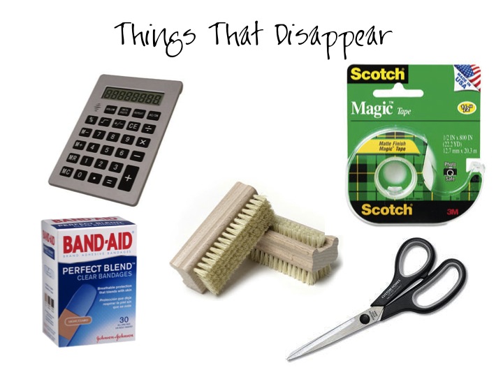
Is it just me, or do you find there are a few items that always seem to disappear?  If only I were a bit more organized . . . 


So, with organization on my mind, here are few images that make my heart sing. 


 Hope you have a "Friday like" Monday.  M.

Thursday Thoughts

Saw this clever space on Pinterest.  Talk about a fabulous small space.  Combining a huge mirror with chain to create a screen, just good.  With the slanted ceilings of this space, most designers would simply place the bed against the window wall and call it done.  Floating the bed in the center of the room really created something special.  Love it.  

Hope you have a wonderful day!
PS:  I am off to see the 2012 Decorator Showhouse this morning and then to a ladies luncheon for the Mom's of the graduating 6th graders (my oldest is going to the Junior High next year - things are about to change dramatically for me him)!  If you are looking for something to do this weekend here in Birmingham, consider a trip to the show house.    For information on the tour go here - 2012 Decorator Showhouse.

PSS: Check out the Transformational Thursday - It's a Party!

Trad-licious

I took a peek at the new TradHome Spring 2012 issue over the weekend and was totally blown away.  With so much eye candy, it went from sheer delight to I dare say overload (in a good way)!   I actually had to take a break midway through for fear that I had reach maximum capacity and was missing things I needed to see (I'm not even kidding).  This is not normal for me.  Usually, I can breeze through a magazine, antique market, or website and find only a few interesting things to think about.  But every single page of this issue had at least one (and usually more than one) scrumptious morsel.  

Just a few of my favorites - Oh, one major caveat before I begin . . . 
If you are trying to refrain from changing your interiors or (following April 15th) your pocket book is not very user friendly, you will want to skip my post today. :)   

For starters, I loved the "Designer's Picks" section with lots of finds I had never seen before.  Especially this bench from Anthro.  Very good.  

Then on to this fabulous DIY artwork of framed fabric - More love.


The possibilities are endless here, and I will be incorporating this idea into some of my design projects.

Then, this article - Two fabulous girls who have organized a group of interior designers to create some wonderful rooms at the Good Shepherd Center for Homeless Women and Children in L.A.  If this article doesn't make you realize how important it is to create a wonderful space to come home to, then nothing will.
 And, I'm only scratching the surface!  There were so many wonderful articles with stunning images.  No skimping here.  A large section of the issue was devoted to "Trads 10" up and coming interior designers to watch.  I loved that each designer had a very unique take on design, and all were stunningly beautiful. 

Pops of emerald green - genius.


And Birmingham Designer - Tammy Connor!  And let me say Tammy's personality is just as wonderful as her design sense.  She truly is one of the most unassuming designers I've ever met.  And her style is timeless.

Lacquered ceilings - holy smoke.

Nick Olson - This room made me think about my up and coming living room!  The black and red are so wonderful in this space.  It feels very eclectic and high end.

More pops of color in a neutral space.  Also, I thought all her rooms felt so fresh - perfect for the season.

Dreamy grey kitchen.  You have to see all the other images they feature on her.  Every last one was amazing.

The midcentury modern vibe here almost did me in!  Just look at that sectional, artwork and my goodness, those curly brass sconces.  Swoon. 

This is not even all of them!  There are more to be seen if you click over.  Oh, and in case you're wondering, no, I am not being paid to say all this!  This issue is just that good.  

When you have more than a minute, you NEED to go check it out! Happy Day. M.


Black and White and Red All Over

Since my rug purchase at Scott's, I've really been thinking and rethinking the direction of my front foyer/ living room.  It's funny how one simple addition to a space can do that for you.  Here is a reminder of the rug in my foyer (the new guy).  

And here is a close up of the Heriz in my living room (hard to see, but this rug has black, red, green, gray, blue, orange in it).  Also, the space is formal and I really want to keep it that way.  I know lots of people are getting rid of their formal spaces.  We love to entertain and I like having two different spots depending on the type of party we are having at the moment. 

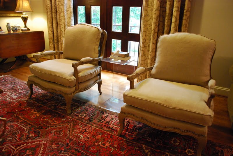
All the upholstered pieces in the space are very neutral.  As for the window treatments, they were fine before, but now with the new rug, they are just not working.  Also notice I have not be able to commit to pillows in here either.  The main problem is that I see so many beautiful fabrics, that I don't want to pick just one, so I have refrained from picking any!  But things are about to change. 
  via

So here are a few of my musings on the room.  

First, an inspiration picture for the idea of neutral with a pop.  This room is more gray than mine, and the pop is pink (rather than red/orange).  But the idea of neutral upholstered pieces with a color pop is the idea.  

I'm thinking -
1. The room needs more black.  The baby grand piano, the drum shades and the pair of prints on the wall is helping, but I need black fabrics on the sofa and chairs to carry the color through the rest of the space and tie the rugs, make them feel more purposeful.
2. I need to edit the window treatments.  They came with the house and served a purpose for awhile; but it's time to move on.  I'm thinking about a smokey gray silk with a fabulous tape on the lead edge of the panels.  Maybe like these . . . 

or these that are a bit warmer, yet still grey.


Then, I would add a neutral tone on tone tape to them just for interest.  Something like this would be pretty.

Now for some accent pillows.  Since the Heriz if very busy, I'm thinking I need at least one (maybe two) accent fabric in a black/grey yet a simple pattern (to contrast the busy rug).  I think this would go a long way in neutralizing the space and allowing the two rugs to be the feature.  Here are a few fabrics that have caught my eye as accent pillows.  Not sure which ones yet or even where they would go, but there are lots of fabric opportunities in the space -  on the sofa, in the bergere' chairs, the accent chairs in the foyer, and maybe even on the piano bench.  

Some texture would be good in the way of a linen.

Option One

Option Two

Option Three

Option Four

And possibly a silk just to tie in the window treatments.

Option Five

Lu Huv this one.  It is oh so yummy!  It's got the creams, greys, blacks and warm beiges in it.  could really pull things together in there.

Option Six

Since my sofa is light, a saturated black might be just the thing for a long sofa pillow.  The trick to making black work in a formal space with neutrals is to pick patterns that do not include a stark white, rather a creamy background is the way to go.

Option Seven

Really like the idea of this one too. 

Option Eight

3. Lastly, the sofa, chairs, etc. needs a small dose of red.  Since both rugs are screaming red, a small shot of it coupled with cream should do the trick.  I love both of these for a sophisticated feeling. This one is topstitched for some added texture (which I love on pillows).

Option One

This one also gets me.  It has a mid century modern thing going on and I think it would really look great with the rugs.

Option Two  

Then, once I've added some pop in this space, I'm thinking my den could use an even more vibrant pop of red.  I will have to share those fabrics with you later this week! In case you were wondering, fabrics are one of the main reasons I love interior design.  Textiles add personality to a space.  So, don't under estimate their power to shape a room!   Hope your week gets off to a great start! M.