Showing posts with label Paint. Show all posts

Paint Trick - Creating a Focal Point

Last week, I helped a client with exterior paint colors for her very cute house.  While I did not take pictures of her house (sorry, sometimes, I get so busy with the task at hand I forget to snap a picture), we did come up with a beautiful schedule. 

The house is a ranch style combination of brick and sliding.  Also, the front door is set back into a covered area.  The current dark color on her front door makes the entire entry way blend into the house and go completely away.  

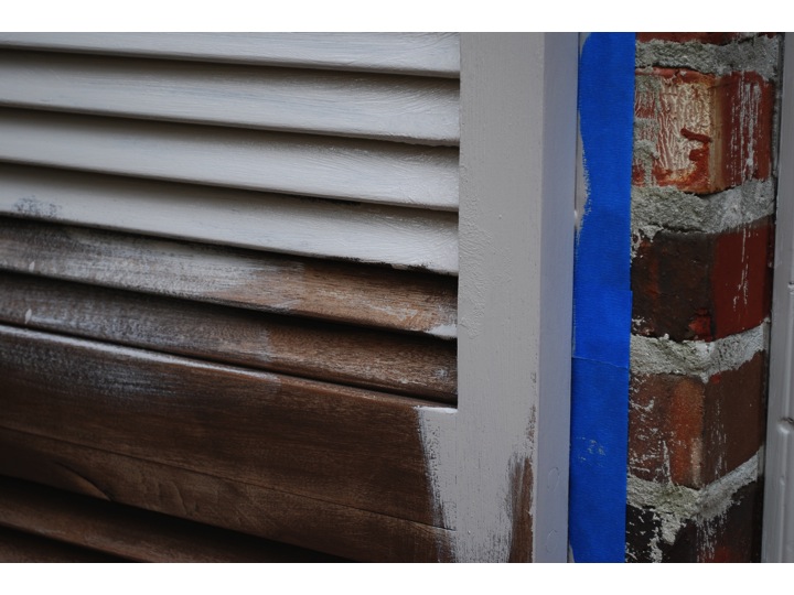
To make things even more interesting, the client has a bit of a dilemma - she really wants to paint the entire house (brick and siding), but it's cost prohibitive at the moment.  The siding and shutters are in need of painting, so they must be done now.  Also, her brick is a bit tricky.  It tends to make any beige/neutral turn peachy.

  So, we came up a plan she could implement in stages.  First, we selected a color for the siding and shutters.  We selected colors that work with the brick color but could be used (at a later date) as a whole house color, should she decide to paint the brick.

For the siding, we pulled BM - Sag Harbor Grey.  It has just enough grey to hold it's own next to the brick (no peachy here!).

For the shutters, BM - Dragon's Breath.  It's one of my favorite go to colors for shutters.  It is dark, but yet soft and sophisticated.  Just perfect for most applications where you need a black.  Also, in our case, the roof has a lot of brown, so a stark black (like BM Black Jack) would not have worked.


  Lastly, we selected a bright fun color for her front door.  Yelp.  That would be yellow.  This will brighten up the dark covered area and draw your eye to the entryway of her home (which, btw, is lovely and should be highlighted). 

BM - Sunbeam

Now, I know what you're thinking?!  Don't be afraid.  What sounds crazy, does not look crazy.  I promise. Here are a few inspiration images to give you the idea.


This is very modern home which looks nothing like my client's house; but the front door is set back in a dark alcove like that of my client's.  Notice how the bright color works to lighten that spot and makes the front door pop.  This is the idea. 


Here is another example of a front door that gets lost without a pop of color.  Yellow does the trick to instantly make it the focal point.

I'm not suggesting that every house needs a yellow door.  But in some cases, it's just what the doctor ordered.  Especially, if you want to make a house sing!  M.


Power of Paint - An Update

If you recall, I recently completed a total transformation of my kitchen using paint and new hardware.  Here is the "After" of my kitchen.  If you want to see the "Befores" and the entire post about it, click here.

Following my post on the power of paint, I exchanged emails with Deborah, a blog follower in Madison, Mississippi.  She saw the post and was inspired to paint her own kitchen.  She was so gracious to share the before and after images of her space with us!  Here is the Before of Deborah's kitchen . . . 

She already had a great cabinetry color and decided to paint her walls the same color.  Look how much larger the entire space looks with the new wall color.  Wow - love a great before and after!

The previous color was P&L Arabesque which is a lovely rich color (I can totally see it as an accent color), and the new color is P&L Light Coffee.  This space opens into her keeping room, so she continued the color into that space as well.  Another "Before."

And the "After" (notice how the artwork really stands out now on the neutral wall).  It looks fantastic!

  Thank you, Deborah, for sharing these with us.  I hope they inspire other followers to think about freshening up with paint in their spaces.  It's one of the least expensive ways to get major impact! M.


The Power of Paint - Kitchen Before & Afters

I have often said that paint can fix a world of interior design mistakes.  You can use it to highlight really great architectural features; or in the case of my kitchen, you can hide a whole lot of ugliness.  

For those who have not had the pleasure.  Here is a Before of my kitchen . . .


And now for the After . . . 
And again. Before.

And After.  It doesn't look like the same kitchen (at least it doesn't to me).
 The color is Ben Moore Grant Beige; and honestly, I think it changes with the light of every hour in the day.  It is looking very warm and green in this shot, but at certain times, it feels grey.  
 In addition to the kitchen, we painted my breakfast room the same color.  You can see how different the color looks in there.  
 Here's another Before picture taken from the same direction.  The dark chocolate color in this before image is called Seal Skin by Martin Senour; and truly, I loved it.  I can't say the same for the maple cabinetry.  Just was not my taste.  

Now, before you start commenting on how you can't believe I painted maple cabinetry, they were not solid.  Instead they were a thin veneer that was just begging to be painted!!!  

The kitchen is in the center of my home, so I have no windows in the space.  This made the chocolate color feel even darker.  I think the lighter color really helped to make the space feel larger and more airy. 
 In addition to the walls and cabinetry, I also painted all the trim the same color.  This is a great trick to make a room feel larger and more cohesive.  When a room has a lot going on (i.e., cabinetry, door casings, windows, etc.) it can feel very chopped up.  By painting it all the same color, it becomes cleaner and larger. 
 I still have a few extra things to do in the space, but I wanted to show you the progress.  I plan to include some simple sheer linen cafe curtains on the bay windows, just to soften the look (it is very private in the back, so I'm going with a sheer fabric) hang some new artwork (maybe those sea fans I found), and some lighting over my island.  I will share all those ideas with you in a later post (would love your thoughts).
 But for now, I am loving the change.  
 Oh, one last thing.  I changed the hardware on all the cabinets.  What I love about these pulls is the size.  I really think the larger hardware feels more current.  These are 7" pulls.  I put my hand on them to give you an idea of the actual size.

In this picture you can really see how the pulls stand out in the space.  

Overall, I am thrilled with the result.
The power of paint never ceases to amaze me.  Even in my own kitchen.  
Happy Monday.  M.


Color Stories Brand New at Benjamin Moore

Have any of you used the brand new color palette from Benjamin Moore called Color Stories?

  I saw it recently when I went in to buy paint for my media wall project.  I'm told the line was created to compete with Farrow and Ball (which is not available locally).  So, I'm dying to get my paws on a fan deck!  If any of you have tried the new colors,  I would love to hear your thoughts and favorites. 


Also, I learned something else during my visit - Do you know how to tell whether you have oil or latex paint on a surface without having to lug it into the paint store with you?
  
The test: simply rub denatured alcohol (aka finger polish remover) on the painted surface.  If the paint comes off on the cotton ball it's latex, if not it's oil based.  It's that easy! M.

PS: We are very close to finishing our media room project, so stayed tuned.  I promise to show you pictures as soon as I'm finished. 

DIY - Painting Shutters

For the past year, our shutters have needed attention.  I'm sure my neighbors were thinking, "We were wondering if you noticed!"  I definitely did - but, as we all know, life just seems to get in the way and the shutters never made it to the list.  Back in November I thought, it's now or never for this year.  So, we got busy.  
When we moved into this house, the shutters were stained, but in need of a refinish.  We hired a guy to do this for us.  It was expensive and took two weeks.  So, this time, I decided we just needed to paint them (the doors were still in great shape, so we just focused on the shutters).  
Since this was going to be a "quick" DIY job, I managed to talk my husband into helping me.  It was really not a difficult job.  In fact, Chris at Sherwin Williams in Homewood, gave me everything we needed and a lesson on how to do it.  

But, quick it was not.  We painted the entire weekend and still did not finish.  We took a break and finished up the following Saturday.  I know we saved some money, but my question is how valuable is your weekend time with your family?  I'm glad we did it, but not sure I would take it on again any time soon!  

For those who think it's worth your time, here's how we did it.

Step 1
Sand any loose chipping paint from the shutters and wipe them down with a clean damp cloth.
Step 2
Tape off the area to prepare for painting.  This step was crucial for us.  In fact, with the first swipe of my brush, it was all over the tape and I thought, "Wow . . . totally worth the extra time."
Step 3
Apply one coat of the proper primer (ask your paint specialist what you'll need).  Since our shutters were previously stained and varnished, we had to start with a primer that sealed them and allowed you to then go back over them with a latex paint.   
This stuff was as thick as fudge sauce and my arm was killing me when we finished.  But, an ibuprofen and glass of wine later, I was fine!
Step 4
Apply your paint color of choice.  Since the primer we had to use could not be tinted the same color as the paint, it took two coats to do the job.  

I really think we needed three, but realized the second Saturday that I would not be squeezing another coat out of the man, so I'm good with two!  Let's just pretend the pumpkins are not in the picture.  K? (After we finished this job, I got so busy with client projects that I did not have time to draft a post about it - thus the pumpkins in the picture.)  But you get the idea!  

I have a few DIY projects on the list for 2012 and will share them with you in the near future.  What about you?  What do you have on the list this year? M.

If I Were Handy . . .

I would zip over to IKEA and pick up this for $299.00 . . . 

Then I would order some chalk paint which is very forgiving and easy to work with.  I would get it in this color . . . 


Then I would sand off a bit of the paint on the edges to let the original color show through like this . . . 


Then I would change the hardware to these ($4.76 each) . . . 


And get a very similar look to this for a fraction of the cost . . . 


This stunning piece retails for $1,500.00 and is on sale for $699.00 at Kings Lane this week.  


Artwork Tip: If you are in the Birmingham area and want to check out some amazing original artwork, my talented friend Ashley Terrell is in town showing off her work.  You can see and purchase her pieces on Thursday, September 29th from 10am-7pm at the home of Betts and Lauten Johnson (2201 Shades Crest Road). Ashley's calling the show "Art with Reach" which is so appropriately titled given her affordable prices!    Have a great day.  M.

Let's Go Craig's Listing - Pair of Bookshelves

A pair of narrow bookshelves for a steal of a deal at $75.00!

You could paint them with this . . . 

To make them look like this . . . 

And you could use them like this . . . 

Or this (image on the right).

I can't believe it's already Wednesday.  Hope your week is going well! M.